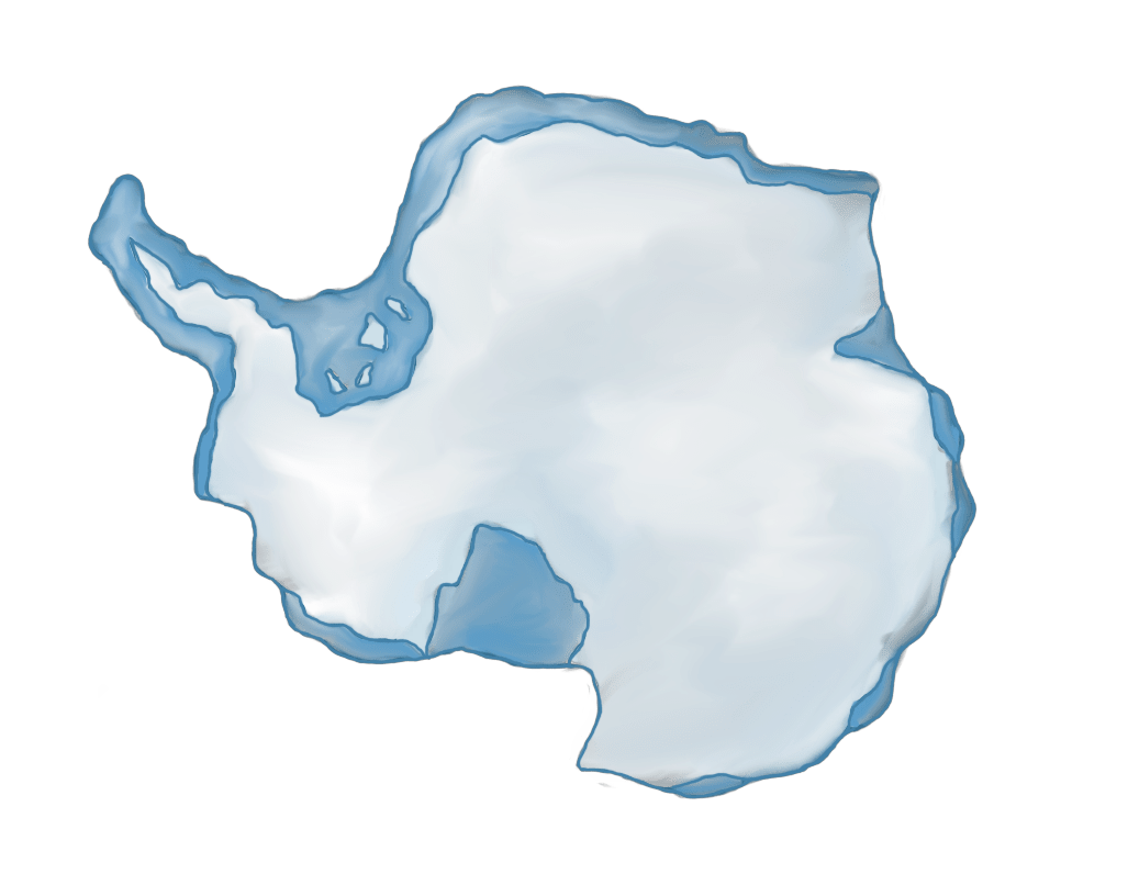
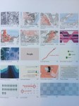
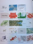
 I’ve always appreciated the beauty of maps and the visual stories they can tell. The colours, lines, shapes depict a geographical landscape. With the New Zealand festival of the arts writers programme running in February 2020, I was lured into hearing some of the authors speak about their recent publications. Chris McDowall, Nadine Anne Hura, Veronika Meduna and Meng Foon took delight talking about their contributions to “WE ARE HERE: An atlas for Aotearoa”. The book encapsulated over 1000 years of social history and millions more of geological time eras. The use of data visualisation helps us see the past to peer into the future. It’s is a visual feast for the eyes; a celebration of New Zealand’s natural, social and cultural history showcased in infographics and maps.
Chris provided an overview as to how the book came about. It was essentially a passion project that was slow to gain momentum. The author credits the book to being a lot of hard work – however his passion and dedication ensured the wheels kept turning. Chris acknowledged it was also a matter of trusting the journey and to rely on ‘magic’ or ‘flow’ as the book slowly developed.
Veronika spoke about her chapter on air and water. She acknowledged gaining a balance between simplicity and detail; I especially liked the analogy of river patterns drawing on similarities to that of the human body. Veronika’s concept of data visualisation being data poetry also appealed to me. Being a writer, Veronika appreciated the medium of conveying information without the use of many words. “It is also about belonging”, the book is not only about landscape maps but also data visualisation of New Zealand’s natural and cultural history.


A discussion about the word ‘data’ evolved. There was a deliberate decision not to overuse the word data. In today’s modern technological world, people align the word ‘data’ to their digital devices. However, Veronika acknowledged “I love the use of data”. Just look at the things we measure and the modelling that is used. Data can be a wonderful way to open up a narrative; it’s an avenue to channel stories. A further discussion was centred on the use of “we” and who is included in we? The title was the trigger. What is the story behind the story and the story behind the data?


I reflected on my own map making, having sketched various maps. From the geological history of Gondwana to bird distributions in the Galápagos the map designs had come naturally to me. But what was more challenging was collating the research and ensuring how credible the statistical data was. After all, the golden rule is information first, design second.


To conclude the author’s shifted their focus towards the future. History is important, for we struggle to comprehend the future without turning back the pages of time. This book illustrates change over time in New Zealand and for people to geographically and historically position themselves. Nadine highlights it can also be a test between Western and Polynesian values; it can create a growing sense of division. Ultimately, everyone can share different values and to work towards a shared common goal. And what better way to reach a wide audience, then through glorious pictorial maps and graphics.

Leave a comment